The 70/20/10 rule is a simple, time-tested formula for creating a balanced and visually engaging color palette in a room. It breaks down your color distribution like this: 70% dominant color, 20% secondary color, and 10% accent color. The goal is to create harmony while still allowing room for personality and contrast. The dominant color usually sets the tone of the room, think walls or large furniture. The secondary color adds depth through rugs, curtains, or side chairs. And the accent color adds energy through accessories or artwork. This method keeps your space from feeling flat or overly chaotic.
Why Color Balance Matters in Decorating
A room’s color palette can make or break the entire design. Too many similar shades can look bland, while too many competing tones feel overwhelming. The 70/20/10 rule provides structure and intentionality. It helps you blend comfort with creativity, enough cohesion to feel polished, enough contrast to keep things interesting.
Color balance affects mood, scale, and even how clean or cozy a space feels. The right mix enhances flow between elements like furniture, flooring, and decor. With the 70/20/10 rule, you don’t have to be a color theory expert, you’re using a guideline that keeps every space inviting and well-composed.
Applying the 70%: The Dominant Color
This is the foundation of your room’s color scheme. Your 70% color is usually a neutral or subtle tone that appears on large surfaces like walls, area rugs, or sizable furniture. Think whites, grays, soft blues, or earthy tones, shades that offer visual consistency without overwhelming.
Why it works:
-
Creates a cohesive base
-
Sets the mood (warm vs. cool, calm vs. energetic)
-
Acts as a canvas for secondary and accent elements
Choosing the right dominant color ensures the room feels grounded. It supports the other 30% of your palette and should reflect your overall style and light conditions.
The 20%: Adding a Secondary Color
Your secondary color brings contrast and interest without overpowering the space. It makes up 20% of the design and often appears on curtains, accent chairs, bedding, or cabinetry. This color should coordinate well with your dominant hue while offering variation.
Best practices:
-
Choose a deeper or complementary shade
-
Use it in medium-sized elements
-
Repeat it across the room for rhythm
For example, if your dominant color is beige, a sage green or navy blue can be your secondary. This layer adds richness and depth, ensuring your space doesn’t feel too one-note or overly uniform.
The Final 10%: Accent Colors That Pop
Accent colors make up the final 10%, the playful, expressive part of the palette. This color is usually bold or bright and used sparingly in accessories, artwork, throw pillows, vases, or light fixtures. It’s your chance to introduce personality without commitment.
Accent ideas:
-
Metallics like gold or copper
-
Trendy shades like terracotta or teal
-
Vibrant tones like mustard or coral
Just a few touches in a bold color can energize a room and make it feel complete. The key is restraint, too much accent color can throw off the balance and make the space feel chaotic.
Choosing Your Palette: Where to Begin
Start by identifying your dominant color based on the mood or function of the room. Neutrals or soft tones are a safe foundation. Then layer in your secondary color for contrast, followed by your accent color for personality.
Steps to build your palette:
-
Choose a mood (calm, vibrant, elegant)
-
Pick your dominant neutral
-
Select a contrasting or complementary secondary tone
-
Add a small pop with an accent shade
Use paint swatches, fabric samples, or online palettes to test combinations. Make sure they look good in different lighting before committing.
Adapting the Rule to Different Rooms
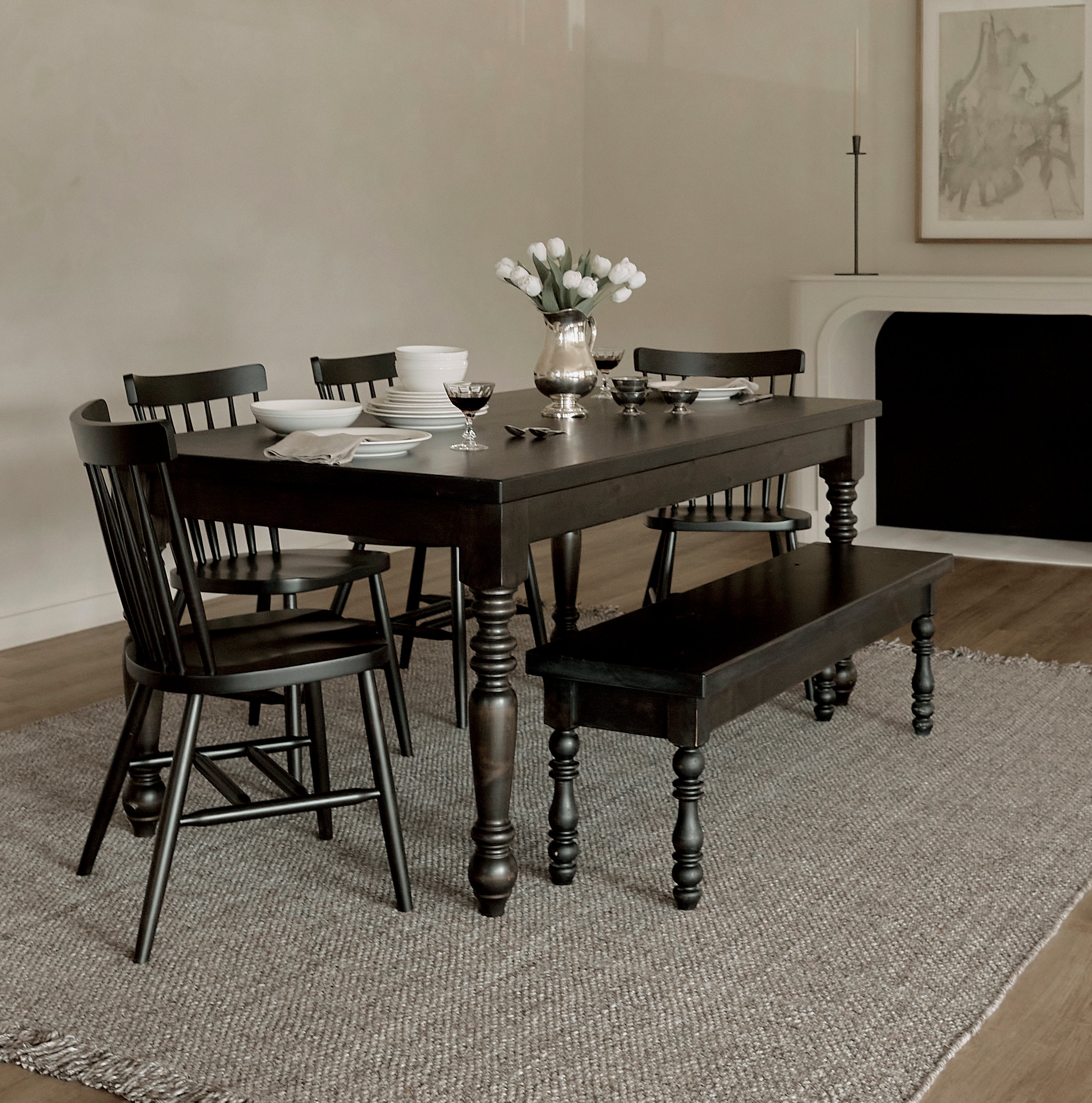
The 70/20/10 rule works for all rooms, but execution can vary depending on function and size. In a living room, the dominant color might be the wall paint; in a bedroom, it could be the bedding. The key is balance.
Room-specific tips:
-
Living Room: 70% walls, 20% curtains/furniture, 10% accessories
-
Bedroom: 70% bedding/walls, 20% nightstands/rugs, 10% pillows/lamps
-
Kitchen: 70% cabinetry/walls, 20% backsplash/furniture, 10% dishes/art
Adapt based on what elements are most visible. The ratios are flexible, as long as the dominant tone stays clearly in the lead.
Common Mistakes to Avoid
Even with a rule in place, some mistakes can throw off your room’s harmony. Here are a few things to watch for:
-
Too many accent colors (stick to one or two)
-
Secondary color overpowering the dominant shade
-
Ignoring how lighting affects perception
-
Failing to repeat colors throughout the space
Stick to the structure, test your palette in natural and artificial light, and avoid trends that clash with your long-term vision. When in doubt, go back to your proportions—70/20/10 keeps things intentional and cohesive.
Can You Break the Rule?
Absolutely, but do it with purpose. The 70/20/10 rule is a guideline, not a strict formula. Some designers intentionally invert the ratio in bold, maximalist spaces. Others drop the accent color entirely for a monochrome look.
Consider breaking the rule when:
-
Designing with all neutrals
-
Styling a highly curated or art-driven room
-
Working with a dominant architectural element like stone or brick
That said, for most homeowners, especially those unsure of how to begin, sticking close to 70/20/10 is a safe and effective starting point.
Tips for Testing Your Color Ratios
Before you fully commit, test your palette using temporary tools. Try:
-
Mood boards with fabric and samples
-
Virtual room visualizers
-
Swapping out decor temporarily to visualize balance
Seeing your ratios in action—especially how dominant, secondary, and accent tones interact—can prevent costly paint or upholstery mistakes. Keep checking your ratios as the room comes together and adjust if one color starts to overpower the rest. Real-world testing will make sure your plan works in practice, not just on paper.
Make It Your Own
The beauty of the 70/20/10 rule is that it gives structure while leaving room for creativity. Don’t be afraid to let your style shine through, whether that’s through a splash of mustard yellow in an otherwise neutral room or soft lavender accents in a classic interior.
Personalization tips:
-
Use textures to vary your palette even within a single color
-
Incorporate patterns to blend multiple hues
-
Swap accents seasonally for a fresh look
Once you’ve mastered the basics, you can evolve your palette over time without redesigning the whole room. The structure is flexible, use it as your canvas.