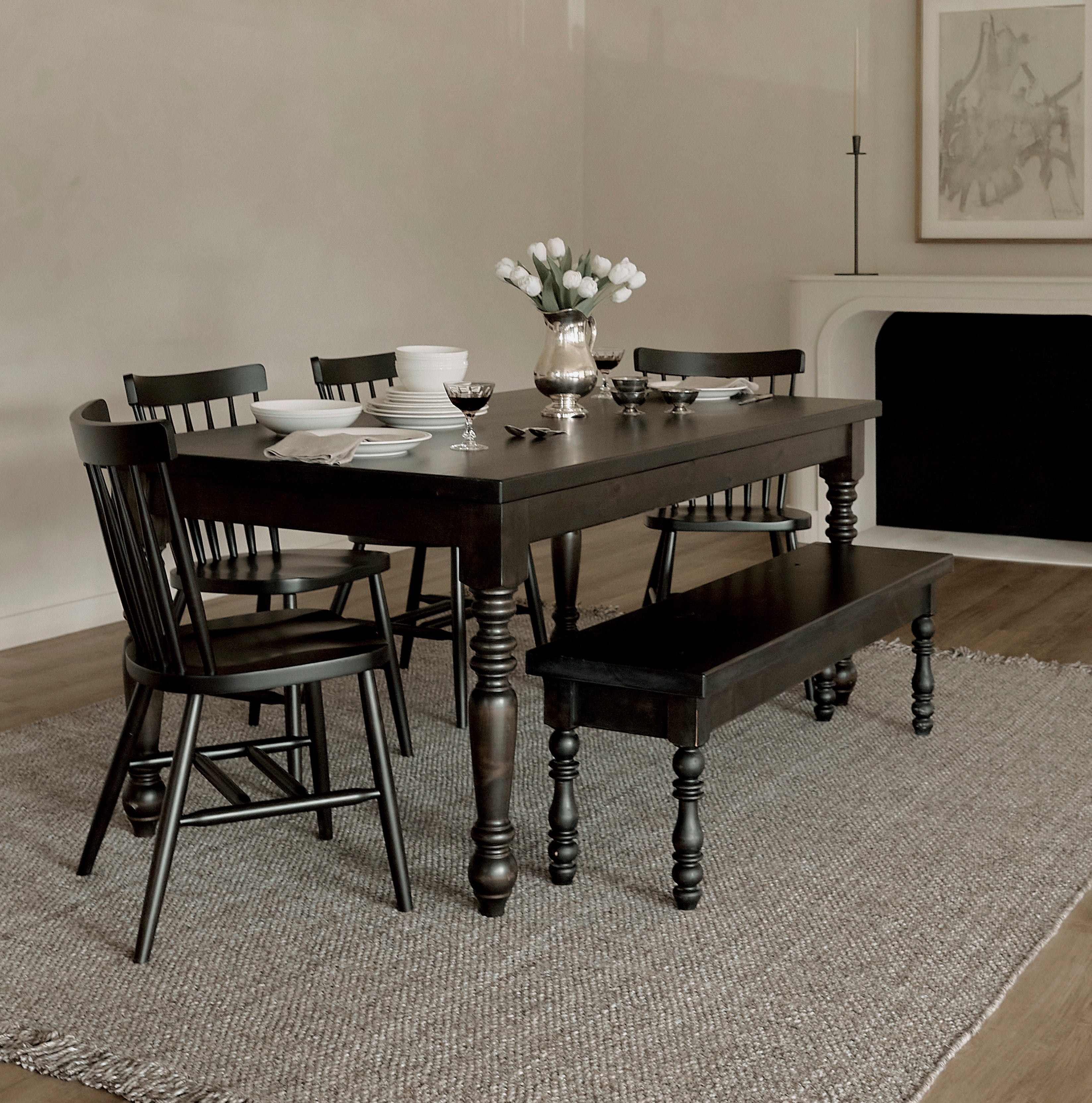
The right stool finish should feel connected to your kitchen without requiring every wood surface in the room to match. Because bar and counter stools sit directly against cabinetry, countertops, flooring, and often nearby dining furniture, their finish becomes part of the larger material palette. When you're comparing our bar and counter stools, start by looking at the finishes already carrying the most visual weight in the room.
The goal is not to find one wood tone that matches everything.
It is to choose a finish that looks intentional beside the materials you already have.
Start With the Kitchen Island
The island is the closest visual reference.
Your stools may sit directly against:
- painted cabinetry
- stained wood
- natural wood
- a contrasting island finish
Decide whether you want the stools to:
- blend with the island
- contrast with it
- connect it to another wood tone in the room
That choice will narrow the finish options quickly.
Matching the Island Can Create a Quieter Look
Using a stool finish close to the island can create a more unified composition.
This may work particularly well when the kitchen already contains:
- bold countertops
- statement lighting
- patterned backsplash
- several other materials
Repeated tones keep the seating visually restrained.
Contrast Can Give the Stools More Definition
If you want the stools to stand apart from the island, choose a finish with clearer contrast.
For example:
- dark wood stools against a light painted island
- natural wood stools against deep cabinetry
- lighter stools against a dark island
Contrast can help each stool remain visible rather than disappearing into the cabinetry behind it.
Avoid Accidental Near-Matches
Two wood finishes that are almost identical can be more difficult to coordinate than two finishes that clearly differ.
If your island is stained wood and the stool is only slightly warmer or darker, the combination may look like an unsuccessful match.
In that situation, either:
- coordinate more closely
- create stronger contrast
A deliberate difference usually feels more refined than a weak near-match.
Pay Attention to Undertones
Wood finish is more than light or dark.
A finish may lean:
- golden
- amber
- reddish
- neutral
- gray
- taupe
Two pieces can differ significantly in darkness and still work together when their undertones are compatible.
A light warm stool may coordinate naturally with a much darker warm island.
Look at the Countertop Too
The countertop sits directly above the stools and can influence how the wood reads.
Consider whether the countertop is:
- warm
- cool
- highly patterned
- visually quiet
A strong stone pattern may benefit from simpler stool finishes.
A restrained countertop may leave more room for the wood grain to become part of the design.
Painted Islands Give You More Freedom
When the island is painted rather than stained, you are not trying to coordinate two major wood surfaces directly.
That can make it easier to choose stools based on:
- flooring
- dining furniture
- cabinetry elsewhere in the room
A painted island often gives the stool finish a clearer opportunity to introduce natural warmth.
White and Light Islands Can Support Strong Contrast
Dark or medium wood stools can add definition against:
- white
- cream
- light gray
islands.
This can ground the seating area and keep the kitchen from feeling overly pale.
The darker the stool finish, the more visual presence it will have.
Dark Islands Can Benefit From Lighter Wood
A deep island already carries substantial visual weight.
Lighter or medium-tone stools can create separation and prevent the seating area from feeling too dense.
This can be particularly effective when:
- several stools sit in a row
- stools have backs
- kitchen has limited natural light
Flooring Is One of the Most Important References
Stools expose a large portion of their legs and base directly against the floor.
That makes flooring particularly relevant.
If you have hardwood floors, decide whether the stools should:
- coordinate
- contrast
with them.
Exact matching is not necessary.
Wood Stools Can Disappear Into Similar Flooring
If the stool finish closely matches the hardwood floor, the lower half of the furniture may visually blend into it.
That can be useful if you want the seating to remain understated.
But if you want the stools to have more presence, clearer contrast may work better.
Contrast With the Floor Can Define the Seating
A dark stool against light flooring or a lighter stool against deep flooring can make the furniture easier to see.
This is especially effective with:
- backless stools
- open frames
where much of the design appears below the counter.
Do Not Judge the Stools Against One Surface Alone
The stool sits at the intersection of several materials.
Look at it beside:
- island
- floor
- countertop
- dining furniture
- cabinetry
A finish that works perfectly with one element may conflict with the room as a whole.
The broader palette matters more than one exact match.
Consider the Dining Table
In an open-concept kitchen, the dining table may be highly visible behind the stools.
You do not need to match the table exactly.
But the two wood tones should feel deliberate together.
You might choose to:
- repeat the dining-table finish
- use a related undertone
- create intentional contrast
All three can work.
Dining Chairs Matter Too
If the dining chairs use a different finish from the table, your kitchen may already contain more than one wood tone.
That can actually make stool selection easier.
Instead of adding another unrelated finish, consider repeating one of the existing tones.
Repetition creates cohesion.
Limit the Number of Major Wood Tones
There is no strict rule for how many woods a room can contain.
But the more large wood finishes you introduce, the more intentional the palette needs to be.
A simple approach is:
Primary wood tone
Flooring or dining table.
Secondary wood tone
Stools or cabinetry.
Accent tone
Smaller furniture or accessories.
This provides variation without making the room feel fragmented.
Use the Stools to Bridge Two Existing Woods
Sometimes the kitchen and dining room already have different wood finishes.
The stools can act as a transition.
A medium-tone finish may visually connect:
- lighter dining furniture
- darker cabinetry
without matching either one exactly.
This can be especially effective in open spaces.
Backed Stools Make Finish More Prominent
A stool with a wood back exposes more finished surface above the island.
That means the wood tone becomes a stronger part of the room.
If you are choosing backed stools, evaluate the finish from across the kitchen—not just beside the island.
Backless Stools Give the Finish a Quieter Role
Much of a backless stool may sit below the countertop.
This gives you more flexibility.
The finish still matters, but it may function more like an accent than a major visual element.
Several Stools Magnify the Finish
One wood stool creates a small amount of color.
Four or five create a repeated horizontal band across the island.
That means a finish that feels subtle on one sample can become much more dominant when multiplied.
Always visualize the entire set.
Darker Finishes Add Visual Weight
A darker finish generally makes the stools feel more:
- substantial
- grounded
- prominent
This can work beautifully with a large island.
In a smaller kitchen, several dark backed stools may create more visual weight than expected.
Lighter Finishes Feel More Open
Lighter wood can reduce the visual mass of a stool row.
That may work especially well when:
- island is large
- stools have backs
- kitchen already contains darker materials
The seating can remain substantial through hardwood construction without feeling heavy.
Medium Tones Are Often the Most Flexible
Medium wood finishes can sit comfortably between:
- light cabinetry
- dark flooring
- mixed dining furniture
They can be particularly useful in homes where several existing wood tones already need to coexist.
Upholstery Changes the Finish Relationship
If the stool includes upholstery, the wood finish is only one part of the palette.
The fabric may become equally or more visible.
Evaluate the combination of:
- wood
- upholstery
- island
- countertop
rather than choosing each material independently.
Neutral Upholstery Gives the Wood More Influence
Cream, beige, gray, and other restrained textiles allow the wood finish to carry more of the visual identity.
This can make natural grain and finish tone more noticeable.
Strong Upholstery Colors May Call for Simpler Wood
If the fabric introduces:
- strong color
- pattern
- texture
a quieter wood finish can keep the stool from becoming visually busy.
Not every component needs to make a statement.
Lighting Changes Wood Finish
A finish can look different under:
- natural daylight
- recessed lighting
- pendant lights
- evening ambient light
Kitchen lighting often sits directly above the stools, which can amplify:
- warmth
- red tones
- golden tones
in the wood.
Evaluate the finish under the lighting you actually use.
Pendant Lights Can Make Warm Finishes Look Warmer
Warm bulbs may deepen:
- amber
- brown
- reddish
tones.
If the finish already leans warm, observe it carefully at night.
A sample that looks neutral during the day may look noticeably richer in evening light.
Physical Finish Samples Are Worth Using
Screens can distort:
- tone
- brightness
- undertone
If finish samples are available, place them in the actual kitchen.
Compare them directly with:
- island
- flooring
- dining table
- cabinets
This is much more reliable than judging from product photography alone.
Move the Sample Around the Room
Do not leave the finish sample in one location.
Place it:
- against the island
- near the floor
- beside the dining table
The same finish may relate differently to each surface.
You are looking for the option that works best across the entire space.
Look at the Sample From a Distance
Stools are rarely viewed from a few inches away.
Step into:
- dining room
- living room
- entry
and look back toward the island.
This gives you a better sense of how the complete stool row will read.
Live With the Samples if Possible
A finish that immediately attracts attention may not be the one that feels best after several days.
Give yourself time to see the wood in:
- morning light
- afternoon light
- evening lighting
The strongest long-term choice is often the one that integrates naturally.
Natural Variation Is Part of Solid Wood
Real hardwood will show differences in:
- grain
- tone
- figuring
even when several stools use the same finish.
That variation is part of the material.
A set should coordinate without looking artificially identical.
Do Not Expect Solid Wood to Look Printed
A natural furniture set has character.
One stool may show more visible grain.
Another may show subtle tonal variation.
That individuality is one of the distinctions between real hardwood and a repeated manufactured surface.
Our Hardwood Stools Are Designed to Coordinate
Our made-to-order hardwood stools are crafted through a trusted U.S.-based artisan partner, with finish options intended to coordinate naturally with the broader James & James furniture palette.
That can be helpful when the kitchen and dining areas include other James & James pieces.
Coordination does not require every finish to be identical.
Think Beyond Today's Kitchen
Quality stools may remain in the home for years.
You may eventually change:
- paint
- rug
- dining chairs
- lighting
while the cabinetry and stools remain.
Choose a finish with enough versatility to survive those changes.
Avoid Choosing Solely From a Trend
Very light, very dark, gray, red, and natural wood tones all move through design cycles.
If you intend to keep the furniture long term, choose primarily for:
- architecture
- surrounding finishes
- personal preference
rather than what is currently most fashionable.
Let Easier-to-Change Elements Carry More Trend
You can update:
- rugs
- pillows
- paint
- decor
much more easily than a set of high-quality stools.
The furniture finish should provide a stable foundation.
Ask What the Room Needs
Does the kitchen feel too light?
A deeper stool finish can add grounding.
Does it feel visually heavy?
A lighter finish may create relief.
Are there already several woods?
Repeat one rather than adding another.
Does the island disappear into the room?
Contrasting stools can give it more definition.
Finish should solve a design problem.
A Simple Stool-Finish Process
1. Identify the island finish
This is the closest reference.
2. Identify the flooring
Especially if it is wood.
3. Look at the dining furniture
Determine which tones are already repeated.
4. Decide whether the stools should blend, contrast, or bridge
Give the finish a clear role.
5. Consider the stool design
Backed, backless, upholstered, or all wood.
6. Test physical samples
If available.
7. Check the lighting
Day and evening.
8. Step into the adjacent room
Judge the entire stool row.
9. Choose for long-term flexibility
Not only today's trend.
The Right Finish Should Belong to the Whole Room
Your stool finish does not need to match:
- island
- floor
- dining table
all at once.
It needs to create an intentional relationship among those surfaces.
Sometimes that means repeating an existing wood.
Sometimes it means creating contrast.
Sometimes it means using the stools to bridge two different tones.
Choose the finish that makes the kitchen and dining space feel more complete—not more coordinated for coordination's sake.
Explore our bar and counter stools to compare hardwood and upholstered designs, counter-height and bar-height configurations, backs, and finish options for your kitchen island or bar.